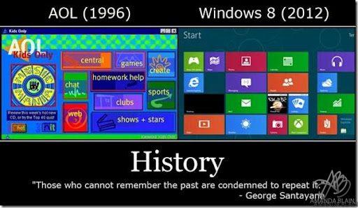
History Repeats Itself- Especially Microsoft
previous post

Come On Microsoft… do we learn nothing for our mistakes? 🙂
All jokes aside, Windows 8 is on my radar, but mostly because of the XboX. 🙂

Business Owner & Geek Girl. Likes Technology, Virtual Reality, Video Games & Social Media. Previously Famous on the Internet I'm press at a few places. I own this site, World Of Geek Stuff -https://www.worldofgeekstuff.com and Girlfriend Social - https://www.girlfriendsocial.com

Microsoft better do something this year….
lol ~_~
LMAO, is that REALLY the way it looks??
plus.google.com/u/0/b/102599706419729268576/102599706419729268576/posts
o_o
No…THEY don't…
Microsoft is currently big headed because of their success in the gaming industry. It happened to Sony after the success of the ps2. Then Sony learned from their mistakes. The one thing Microsoft probably isn't going to do is lose its "too big to fail" mentality.
microsoft if you're going to rip something off at lease rip something off worth stealing not something someone else did 16 years ago.
They had that Too Big to Care mentality when it came to mobile computing, but now…….
Historically each MSC OS release since 3.1 has been good, bad, good, bad. 3.1 was good, 95 sucked, 98 good, ME sucked (BAD), etc…do the math Windows 8 will suck ass
Or, AOL was ahead of it's time. Time will tell when 8 comes out.
why do i get the feeling windows 8 is going to be windows me/vista all over again?
As ridiculous as it looks, I will end up using Windows 8. I will probably enjoy it, too.
As long as it still runs all my shit.
History?? Looks allot like the Apple vs. Samsung case! lol
the Metr.. eh Modern UI looks really really ugly.
……
Amanda you are write, well done.
Programmers are definitely on an ego trip. They're designing things to show off how fancy they can make things and telling us it's better for us instead of designing what users really want. Linux is doing the same thing with KDE and Gnome and Unity.
ohk
hangout 😀
I don't understand why the simply solution, The Windows 7 desktop being included as an option and being promoted as included as an option, is not being promoted as and included as an option.
i.imgur.com/0aPjL.jpg
the design is there due to touch screens coming.
existing windows design does not work on touchscreen
Windows Desperate Monopoly Edition
AKIHLTWGYPFENCUSMDXVRBO
Windows 8 RTM is available to TechNet subscribers today, and I don't even know if I want it.
😀
It really seems like it in more ways than just computers!
oh come on..TED fanboyz.. embrace the remix…lol..
BTW- its a copy of an infamous failed interface of a Philips VCR in the 80s.
Yet only my left eye is bleeding :p
It does work. Windows has had tablet features for some time. I'm sure something designed to work better with a touchscreen could work better with a touchscreen, but I perceive no reason to remove the legacy desktop altogether for obvious reasons of that the mouse and keyboard as standard interface devices work quite well on a desk. I'm not arguing against unifying the OS across different devices. There doesn't seem to be a good reason to subtract the legacy desktop. That's all I'm sayin'. Also, everybody needs to see things my way. 🙂
I've been saying for a couple of years now that XBL is an updated version of AOL: You're paying extra for a lot of content and functionality that you can get for free (not including Internet access costs).
+Christopher T. Calhoun the desktop is still there. just alt+tab to it. The new interface is more like the start menu..
Graphics were better in '96…
so?
I'm inclined to feel that PSN is better at this point.
that's not exactly true. That desktop is just a metro app. Try alt+tab then try window+tab and what I'm talking about becomes more clear
I so can't wait to see this happen!!! Way to go Microsoft on trying something different… "Lest We Mac Users Forget" on well.. change (you are welcome to talk to me if you know what SCSI is, and why they at the time embraced USB) " oh ya… the transition from Mac OS 9 to Mac OS X… ya that never hurted :-/?!?!?
can not find any references to desktop only being a metro app anywhere. you got some?
Don't have wibndows 8 installed atm so can't really try it now. uninstalled when office gave me installation hazzle.
Another sign of failure, rip xp, vista, winblows 7 and next up winblows 8. On the bright side they appear to be dropping the price for their crap software. I guess that's a +
the metro style however works quite nice for outlook.com. and ive seen the MS office 2013(i think) preview, it has the same theme. and works well there aswell
that being said, i think the metro style on the phone are the ugliest thing ive ever seen in my life
You can still do everything from the desktop. The tiles can basically be used as a really big start menu if you like…its even accessed the same way, the button just isn't visible until you run the mouse to the bottom left corner. I'm actually really liking the preview.
cm on stop
It's everywhere? The "metro start menu" is the new desktop UI. It has a completely new SDK to write your apps against: msdn.microsoft.com/en-us/windows/apps/br229516.aspx
These apps will_not load in the "desktop UI" because they are flat out incompatible. That UI btw is now simply called the explorer shell and is around for legacy apps only …. and will_not load new metro apps using the new SDK.
Here's some more plainspeak on it: www.osnews.com/story/25951/What_s_wrong_with_Windows_8
"Contrary to popular belief, Metro is not a replacement for the Start Menu. Metro is a replacement for the Explorer Shell. The Explorer Shell itself has been turned into an application. Traditional applications run within this Explorer Shell, and cannot be managed from Metro. In other words, the Explorer Shell has become an application with a multiple document interface, running in Metro."
They are completely separate environments. Not sure how else to put it. You can even swipe and "close" the explorer shell …. flat out unload it (it will load again if you hit the proper tile). You can't unload the new default UI.
That funny!
like..
Well the windows is spectacular, i like the new updated interface….and d signing out… i feel like im enveloped within the windows…
STOP IT!!!!!!1
well at least in Linux based systems you can pick a new UI (or none). And there isn't a big company shoving it down our throats. And with Linux based systems, if you don't like it, fix it.
UGHHHH
The similarity is truly amazing…
It looks horrendous.